ShopDreamUp AI ArtDreamUp
Deviation Actions


Suggested Deviants


Suggested Collections


You Might Like…


Featured in Groups

Description
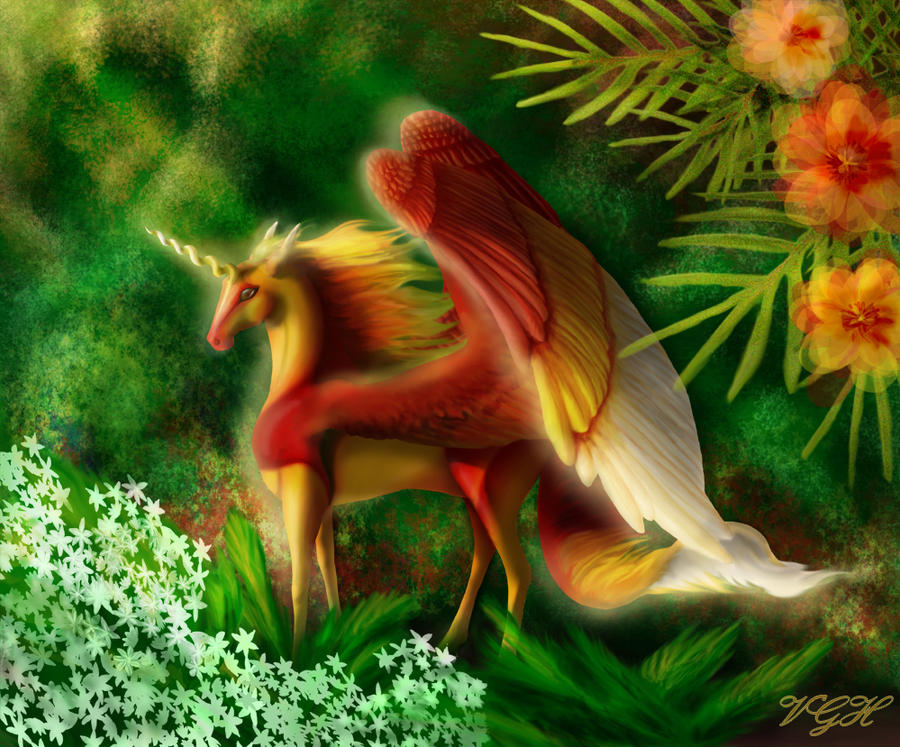
This has been my pet project since about November, but unfortunately I decided I couldn't get it to look like I wanted about a month or two ago. Since then I've just been playing around with it for fun, but I'm getting a bit tired of it now, lol, so I'm calling it finished. It may not look like I wanted to (mostly her, her markings/coloring aren't what I wanted) it still looks nice I think, kinda pretty ^_^
From scratch in Photoshop, 30+ hours.
From scratch in Photoshop, 30+ hours.
Image size
1000x829px 816.74 KB
© 2009 - 2024 VGiselleH
Comments53
Join the community to add your comment. Already a deviant? Log In
Heh, I just had to try out this new critique interface DA has, so I took the chance to do so. <img src="e.deviantart.com/emoticons/w/w…" width="15" height="15" alt="
First of all I would like to say that this is probably my favourite among your unicorn paintings. The main reason for this is actually not the unicorn itself but the things that surround it. Particularly the flowers in the upper right with their half-transparent petals makes for a dreamy and painting-like feel. Them and their adjoining greenery are masterful, really. I think this is one of the first time I see this "looser" style from you in a complete work of art (not a sketch) and it's impressive.
Same with the white flowers in the lower left, they are not realistic in the least, but looks pasted on, as if we were looking at an old chinese painting or something, in this case it works and is really cool.
This is also part of the critique though, your unicorns always have a rather otherworldly look to them (they are stylistic versions of real horses, with their graceful features enhanced). This is just fine, but in this case I feel you are clashing with the surroundings. I think you had a dreamy feel in mind when doing this, from looking at the slight blur of light surrounding the character, as well as the colours chosen. But the unicorn follows your normal pattern of precision and seems done in a different style from the flowers surrounding it. I feel since the flowers look like they are painted flat on a canvas, you should have gone all out and done the same with the unicorn, letting parts of the background shine through its wings and mane, and making it much less clearly defined. If so you could pull this off as a painting, or maybe a historical record of a unicorn, the ones you would find in old books before printing press times maybe.
Composition-wise I like the diagonals you have build into the image, the opposing sets of flowers, the wings and the horn. Only thing is that the upper left corner seems left out; there is no feeling of depth there (fitting the "painting" impression), and yet there appear to be faint rays of light coming from that direction. I choose to ignore this because I feel this works better if one considers there to be an even, otherworldly light over the image. But if you intended light direction to be from the upper left you should probably consider that shadowing is highly inconsistent. Better to assume the unicorn glows then.<img src="e.deviantart.com/emoticons/s/s…" width="15" height="15" alt="
There's some critique to be had, but it's mainly minor things you might want to think about for the future (you know how I mean). Once again I must say I like this. It feels like quite a new artistic style development for you and I like it a lot. Worth a fave. <img src="e.deviantart.com/emoticons/s/s…" width="15" height="15" alt="
.
Griatch